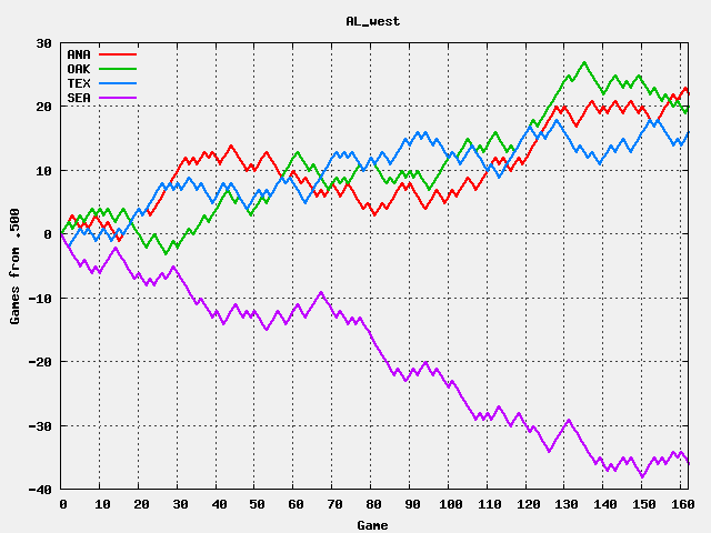
A few years ago, it occurred to me that baseball "standings" over the course of a season could be plotted to show the season at a glance instead of how things stand at the moment. I've named the plots "runnings" since they show how team rank moves during a season.
I never took the time to draw a plot and sort of hoped I could get one of my nephews or my daughter's math class interested. However, that never happened and I decided to hunt down the raw data I needed and do it myself. The results look as interesting as I had hoped. This page describes my initial work and the results for 2004 (the first year this century the Red Sox won with world series). Elsewhere I'm automatically tracking the current season runnings for all six divisions.
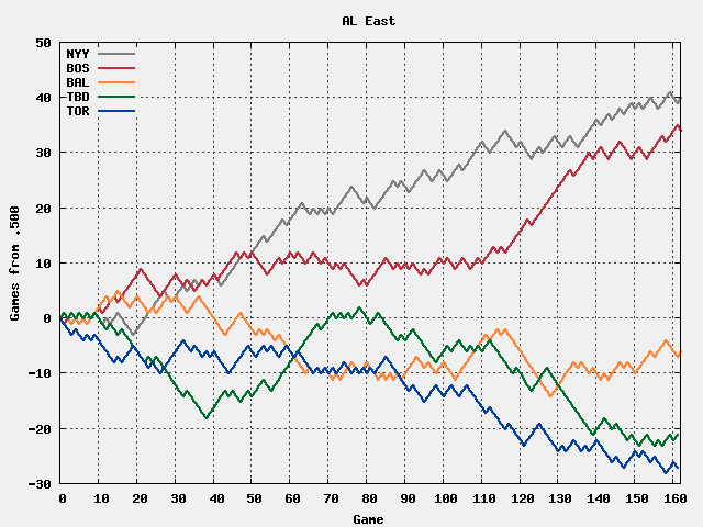
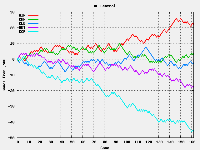
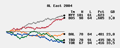
Here are the runnings for the AL East in 2004:
The data is plotted from the start of the season to the end and is simply the number of games a team is above .500. If a team is on a winning streak, the line goes up. A losing streak means it goes down, and if they alternate winning and losing, the line zigzags. All these show up in the plot. Tampa Bay's trace is the most interesting. They alternated winning and losing for their first 10 games, then went 5-23 through game 38. A recovery back to .500 began which includes a 12-0 run. At game 85 they bade farewell to .500 ball sank past Baltimore during a 0-12 run that offset the earlier winning streak.
The Red Sox got off to a good start with a 15-6 start but marked time until game 110. A week later they started a 20-2 streak that led the way into the playoffs where they broke the Curse of the Bambino to get into the World Series. Four games later, Hell froze over.
The runnings for those series hardly need to be displayed but do conveniently demonstrate the extremes of a "best of 7" series:
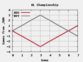
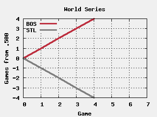
The result is interesting. You can't spot individual game results easily, but it doesn't harm the comparison over time and between teams. In fact, the smaller scale reduces the high frequency roughness making the ebb and flow over the season stand out better.
I have too many responsibilities on the net and elsewhere as is, so I'm not expecting to "corner the market" vis-a-vis runnings. So far, I haven't had time to get other media interested, but I'm generating graphs for the current season each day myself.
More recently, Alex Reisner has finished the job with over 100 years of runnings. The rest of his site is well worth visiting too, especially if you're interested in baseball scorekeeping. He doesn't have the current year, and I have set that up at runnings_2010.html.
While I thought my concept was a nifty idea, the folks behind http://www.baseballgraphs.com/ have gone off in directions that I never would have thought of. Some graphs look very interesting, but I haven't taken the time to understand all they say yet.
The information used here was obtained free of charge from and is copyrighted by Retrosheet. Interested parties may contact Retrosheet at 20 Sunset Rd., Newark, DE 19711.but I can't find the 2004 per game scores there. However, I'm happy to pass along the Retrosheet link, they've done a lot of good work too.
The graphs come from Gnuplot V3.7. Its .png file support is not very good, I see that V4 is much improved. Various C and Python programs work to put everything together.
Contact Ric Werme or return to his home page.
Last updated 2007 June 24.
![]()